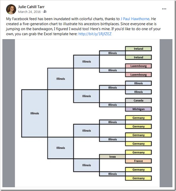
A few days ago I ran across an Instagram post from Cathie (@ancestordiscovery) that brought me back a few years. She posted an image of an ancestor birth place chart she created based on the one that J Paul Hawthrone (@jpaulhawthorne) created back in 2016. His chart went viral, with many genealogists creating and posting their own. Of course, I was one of those (see my original post below).
Seeing that chart again got me thinking: What have I learned in the last five years and does my chart need updating?
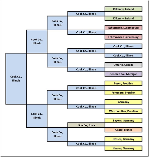
Turns out, nothing changed with regard to those five generations. However, I decided to add a little more detail to the chart.
So here’s the before and after…
Original
New and Improved
If you want to create your own, J Paul provides his downloadable Excel file in his blog post Little Thing That Went Viral… #MyColorfulAncestry.


I just downloaded it this week. It was interesting. I saw just how deep my husband’s Georgia roots are and made me want to check out that side of the family.
That’s great! Glad you found it helpful. Good luck exploring those Georgia roots!