One of the challenges in the GeneaBlogger Games earlier this year had to do with timelines. You can read my post, Working With Timelines to see what I did back in February using Legacy. In this post, I will share with you a different method for creating a timeline.
While Legacy offers a variety of options for their timeline reports, it didn’t give me an option (or at least I couldn’t find it) to plot more than one individual, from different families, in one timeline. Nor could I find a way to do this in Genelines for Legacy. The project I am working on involves four different family groups in two different generations. Some of their starting places were the same, some of their ending places were the same, and some overlapped in the middle. For months I’ve been trying to figure out how to make my own timeline showing four different individuals. I could visualize it in my head, but I was at a loss.
A few weeks ago, it hit me: use Visio. Visio is a Microsoft program used primarily for charts, diagrams, and such (e.g., organizational charts, flow charts, mind maps, web hierarchy, timelines, and much more). I used Visio quite a bit at my last job, and even used it to create timelines for project schedules. Unfortunately, it is not a cheap program (over $200 for Standard 2010, yikes!), but I did find a program called Edraw Flowchart for $50, which may as well be Visio by another name (there is also Edraw Max for $100, which seems to combine all of their suites: Flowchart, Org Chart, and Network Diagram). Although I used Visio for my timeline, I did download the trial version of Edraw and was able to do the exact same thing, including a huge page size. My version of Visio is from 2002, so who knows, maybe I’ll pop for Edraw Max someday.
Okay, so moving on to the timeline. Basically, this particular timeline is looking at four different people over the span of about 100 years.

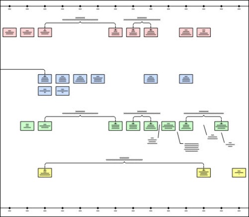
In order to accomplish this, the page is about 75 inches wide. I don’t plan to print it out, but I could print it on a plotter if need be. The image above is a portion of the timeline. I used four different colors to represent each person’s events (the boxes). I then began adding brackets for periods of time where I have no events, noting possible locations to look for records. I also added notations related to boundary and/or location name changes as callouts, which significantly helps in record searches. In addition, I’ve added other notes and questions as a callouts.

This timeline has been a tremendous help while analyzing these four individuals together. For example, my sixth great-grandfather, Solomon Norton, is known to be living in Rutland County, Vermont from 1778 to at least 1820. His daughter, Sarah Norton, married Aaron Webster allegedly in 1797, with locations noted as Washington County, New York or Rutland County, Vermont. The timeline suggests either of these two as possible locations, as well as two other New York counties were Aaron appear around that time period.
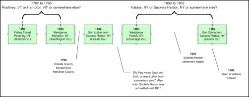
In another instance, this timeline unveiled a possible error with regard to a place of birth for Aaron and Sarah’s first-born son, Luther. The Webster genealogy [1] indicates his place of birth as Sackets Harbor, NY in August 1799. Looking at the timeline, the family is found in Fabius, Onondaga County, New York in the 1800 census. While it is certainly possible that Luther was born in a different place than their enumeration a year later, I also noted that Sackets Harbor wasn’t really a place until it’s settlement in 1801. Furthermore, four subsequent children were also reportedly born in Sackets Harbor, which is possible, but the timeline also reveals that Aaron bought land in Adams, New York in 1804, which is were the family was found in the 1810 census. Without further analysis, it looks like they went from Oneida County in 1799 to Onondaga County in 1800, back to Oneida County in 1802, which seems a little strange, although not impossible. The occurrence of Sackets Harbor and Adams within the same time period is not a major concern as they are very close to one another, so either location could be correct for the events occurring between 1802 and 1812 (through perhaps 1818).
Essentially, the timeline is illustrating information and patterns that all need to be taken into consideration during analysis and further research. By plotting some of the individuals together, I can also how they relate to one another in terms of location. For example, by 1818, Aaron and his family were located in Aurelius, Cayuga County, New York; he was also enumerated here in 1820. My fifth great-grandfather Robert Parks was also enumerated here in 1820. Aaron and Robert both ended up in Oakland County, Michigan shortly thereafter, seemingly “together” (Aaron bought federal land in in November 1821; Robert bought land by deed in October 1822). Seeing these locations in the timeline suggests that they knew one another before they relocated to Michigan. This is something I suspected given the supposed birth locations for some of their children, however I barely made note of it until I plotted it on the timeline, then it became an obvious assumption.
All in all, I would encourage you to visually diagram your timelines, whether for one individual or a few that seem to go together. I suspect that the timelines offered in other genealogy programs are similar to that of Legacy, and although somewhat helpful, the written blurbs in chronological order from top to bottom over a series of pages, for one individual, doesn’t really help the visualization of data and patterns. I know I missed several things until I created a visual diagram and plan to use this method going forward.
Sources
1. William Holcomb Webster and Rev. Melville Reuben Webster D. D., History and Genealogy of the Gov. John Webster Family of Connecticut With Numerous Portraits and Illustrations (Rochester, New York: E. R. Andrews Printing Co., 1915), 401.

Enjoyed this post, Julie. I’ve often thought of doing this with some of my lines. Good to know you found it helpful–I’m sure I would too.