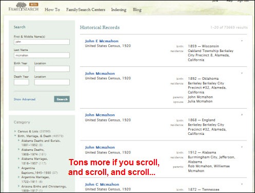
There has been a lot of hype lately about FamilySearch Beta. I, however, have stuck with Records Search Pilot and the “old” FHL card catalog for several reasons, but simply put, Beta is more cumbersome to use. For all intents a purposes, Beta is supposed to be a mirror image in terms of data (not the interface), but there are some exceptions (see my previous post, A Little FamilySearch Experiment, which includes a link to a similar post written by Randy Seaver.). I would imagine that someday Beta will be the only tool available and this scares me…a lot! This post explains some of the concerns I have with Beta when compared to Pilot and the “old” catalog.
Databases & Record Images
Filter Options
This is probably the biggest complaint I have with Beta in terms of databases/records…the lack of filter options currently available in Pilot. Sure, there is slightly better search control in Beta, now being able to specify a specific event with a date and +/- option, but the Beta search is still limited.
Example 1: The Option to Filter by Role – Let’s say I wanted to search for the death certificate for John Smith (d. after 1930) in the database Ohio Deaths, 1908-1953. Beta returns over 10 thousand records. Even with a death year of 1940 +/- 10, there are still over 8,000 results. Sure I can add more search criteria, but you never know what is actually recorded on the record (e.g., was the father’s name recorded correctly, or recorded at all?). In Pilot, I was able to choose the Role, (in this database the choices are Principal or Other). By choosing Principal, I eliminate all the records where John Smith is the father or spouse of the deceased, leaving me with only those records where John Smith is the deceased person. I can’t do this in Beta, and it makes sorting through a huge number of results a tedious task.
Example 2: The Option to Filter by Gender – Many times I’ve run across unnamed babies among my relatives in the Cook County birth records. If I cannot find the certificate/register by the given name and surname in Pilot, I do a search on the surname, and usually add one or both parent given names. Common names still return a number of results, but let’s say I’m specifically looking for a female. In Pilot I could chose Female from the Gender filter, which usually makes sorting through the results more manageable.
I almost always choose a specific database to search in, so the results displayed are narrowed down to that collection. But if I were to search all of the collections at once, I prefer the way the filters for Record Type and Collection are displayed in Pilot (drop-down menu) versus Beta (incredibly long list in sidebar).


Search Screen
While some of the filters in Pilot can be accommodated in the Beta search options, I personally think the search layout in Beta is poor when compared to Pilot. In Pilot, the Advanced Search screen is all within the monitor view (unless you have a really tiny monitor, and even then, it’ll fit pretty nicely without excessive scrolling). In Beta, the Advanced Search screen requires you to scroll (albeit it not too much, but if you are paying attention, you may not notice there are more fields available) Below is what the main Advanced Search screen for a specific collection looks like in both Pilot and Beta (the entire window has been captured on a 17” display).


Granted, there are more fields in Beta than Pilot, simply because each event now has its own field(s) for criteria, whereas in Pilot, you could only select one event. In this sense, Beta wins. You’ll notice however, that the layout for Pilot could easily accommodate those additional fields that would remain visible without the need to scroll.
But the worst of the search is when you want to “refine” the search. In Pilot, you would click on the Refine Search button, and the search window would pop up. In Beta, there is no need to click a button, because the search fields now make up the top portion of the sidebar (which already includes a huge list of record types and collections, mentioned earlier). I prefer the pop-up window over having to scroll or tab to see the rest of the fields. (Can you tell I’m not a big fan of excessive scrolling?) Also, you can access the Refine Search window no matter what view you are in (list of records view, selected record data view, or image view). In Beta, you would have to use your browser’s Back button at least once to get back to the list view.


Also note that the only way you can choose an exact match in Beta, is to display the Advanced Search, both on the main search screen and the “refine” search on the results screen.
FHL Card Catalog
Then there’s the FHL card catalog. A wonderful tool that let’s us know all of their holdings, what’s on film that we can order to our local FHC, and effectively plan a research trip to SLC. When I first started to use the catalog, I’ll admit I struggled. But then I read a tutorial on how to use it, and I was able to use it with ease moving forward. A few months ago the catalog was down for some reason so I headed over to Beta, knowing the the catalog was there as well. It was up and running, which was good, but it nearly brought me to tears!
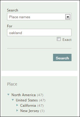
I was working on my Oakland County, Michigan families, so in Beta I selected Place Name and entered Oakland, just as I would have in the “old” catalog. I was presented with a list of 47 matches, well knowing that there were probably more than 47 matches for Oakland County, Michigan, let alone any matches for Oakland, California. I then see on the sidebar a way to narrow the results. I proceed to click on North America, then United States, only to find choices for California and New Jersey…Michigan was not a choice.

I sat there dumbfounded for a minute. Then I tried “Oakland county” as the search criteria (no quotes), and this time, Michigan was listed as an option. Good, I thought, making progress. But it just went downhill from there. The search narrowed down to Michigan, yielded 269 results, in no particular order. I scrolled halfway down the page to the Category section of the sidebar to narrow it down further, based on what I was looking for. To make a long story short, the categories differed from those I was accustomed to in the “old” catalog. Once you find the main topic, you get more topics, and sometimes more after that. You really have to stop and think, what main category would this one thing be under?
It’s not as intuitive as you may thing. For example, let’s say I wanted to see what they had on the topic of cemeteries. In the “old” catalog, I would have done my place search, navigated to Oakland County, Michigan, and then look for the topic “Cemeteries” in the alphabetical listing. In Beta, I would have to figure out that cemeteries is a sub-category under the main category of “Birth, Marriage & Death.”
Another example would be divorce records. I would look for divorce records under the same name in the “old” catalog. In Beta, when presented with all the main categories, I chose “Court, Land, Wills & Financial” since divorce is handled in the courts. Nothing there…perhaps they don’t have any records. But knowing that they do hold a book on this topic in this area, I proceeded to drop down other main categories and found it under “Birth, Marriage & Death,” then “Vital Records.” Okay, I suppose I could buy that, but I don’t agree with it (or perhaps there is a flaw in my logic).
Additionally, you can really get lost between all the items on the sidebar (I’d illustrate it, but it’s so crazy and requires so much scrolling, I can’t provide a screenshot). I’m a pretty technical and logical person, but this sidebar with all the options had me totally screwed up. What’s worse, is that I couldn’t find what I was looking for even though I already knew it was there (I needed a film number that I forgot to note for a source). Imagine what would happen if I were looking for sources in general. Not finding something would lead me to believe they don’t have it…but what if they really do and I’m so tangled up in the criteria that I don’t ever see it? This is by far the worse search experiences I’ve ever had. Plain and simple…I refuse to use Beta for the catalog…I just pray they keep the “old” one, or do a major overhaul to Beta.
Overall Opinion
Personally, I think FamilySearch has done a great service by providing these records online at no cost. I understand that they want one site where everything is accessible at one time, however, I feel that the Beta interface is not up to par compared to the “older” tools as discussed above. I will continue to use the Pilot and the FHL catalog until such a time (if there comes a time) when they are no longer available. If additional changes are not made to Beta upon such a time, then I will not be a happy camper when it is the only tool available for use. Search results will be tedious to comb through and it will take longer for me to find what I’m looking for, both of which do not make me a happy researcher.
So in the “competition” between Pilot/FHL Catalog and Beta, BETA LOSES! Instead, how about out with the new and in with the old?

Hiya Julie! I read with interest your blog posting, in particular the part about CEMETERY RECORDS for OAKLAND MICHIGAN.
Ol’ Myrt here was able to duplicate your work. Then I tried a new search.
From the drop-down box I selected “subjects” (plural) and then typed:
cemetery +oakland Michigan
That seemed to wade through extraneous hits, and come up with some good selections for your research.
Hope this helps!
Thanks for the tip, Myrt.
Julie, I notice that beta still has a feedback tab on the right side of the blog. You could send them your thoughts about the beta version. I don’t think beta is a done deal yet.