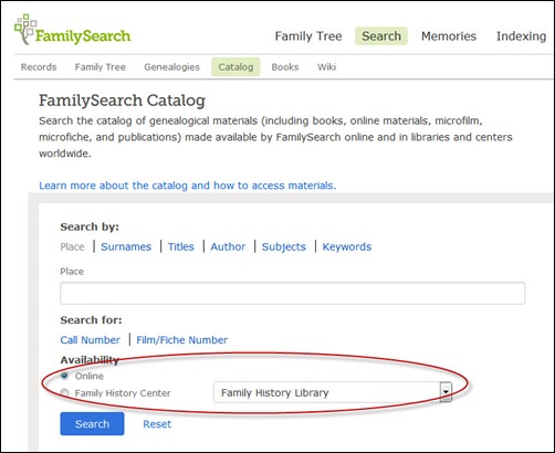
About two hours ago, I blogged about a change to the FamilySearch/FHL catalog that was a little disappointing. It had to do with a new option to filter results by choosing “Online” or “Family History Center” (which with “Family History Library selected shows you everything in the entire catalog, online and off). You can read about it here.
My point was simple: I didn’t like the fact that “Online” was the default (meaning to see everything in the catalog, you’d have to change the filter every time—and if you weren’t aware of this filter, you’d miss out on a lot of offline resources pertinent to your research).
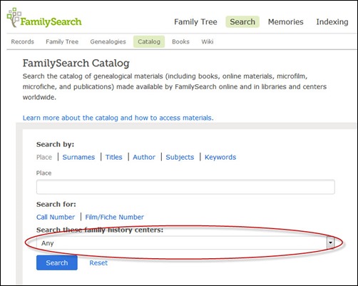
I stepped away for awhile and came back to Facebook comments about the blog post. A friend pointed out that her screen was different (about an hour ago). Lo and behold, I refreshed my screen and ta-da, the screen changed a bit and now the default is set to show everything!
I haven’t the foggiest idea if my post had anything to do with it (doubtful), but if it did, I thank FamilySearch/FHL for responding, and I know that a good deal of my genealogy colleagues will be thrilled as well!
- Old screenshot of catalog search page, taken at 2:21 p.m. CDT. The last screenshot I took of the results page was at 2:42 p.m. CDT.
- Published blog post online at 3:13 p.m. CDT.
- Received comment about change about 4:03 p.m. CDT.
- New screenshot of catalog search page, taken at 4:46 p.m. CDT.
I’m totally good with this!


I’m late reading your posts and commented on the previous one before seeing this one. So glad they fixed the issue! My default is Any!